Capturing demand in 'quiet luxury':
The rollout of Notify Me
In early 2024, following the complete sellout of Phoebe Philo's debut collection, I led the design and rollout of a post-purchase demand capture system in just four weeks. Working with Customer Service data, CRM constraints, and a cautious brand team, I designed a waitlist feature that balanced user fairness with operational simplicity, converting 26% of notified customers, while reducing support volume and proving that transparency strengthens, rather than dilutes, luxury positioning.
Role
Senior Product Designer (Design Lead)
Team
Managed a Product Designer
Year
2024
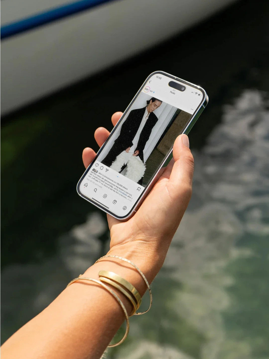
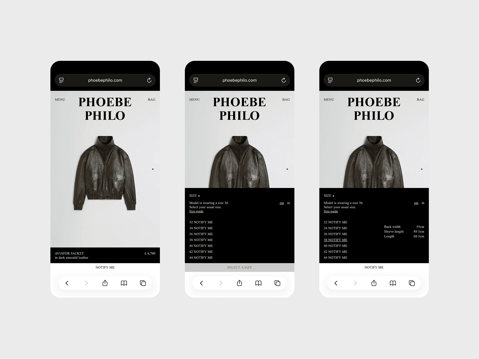
All images courtesy of
phoebephilo.com
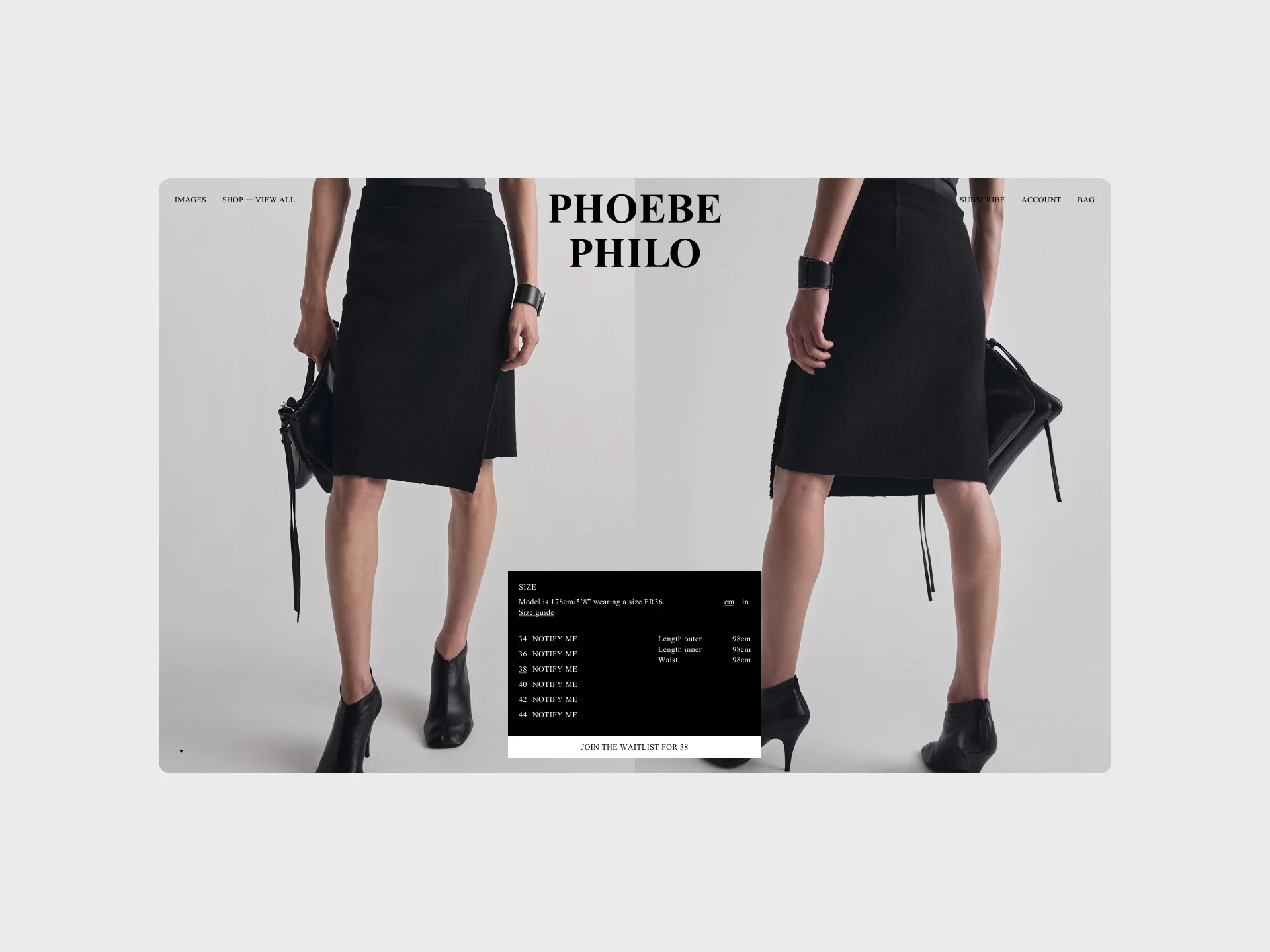
PDP with Notify Me styles
The problem
In October 2023, Phoebe Philo launched her LVMH-backed, digital-only fashion brand. I led design for the launch, which handled an unprecedented demand: 484,000 visitors in 48 hours.
But success exposed a critical gap: products sold out in under 48 hours, and we had no way to capture demand once inventory was gone.
Traffic spiked during drops, then flatlined between them. Resale listings appeared at 3-5x retail price: Peak Sunglasses sold for £1,200 against a £350 retail price. Customer service was overwhelmed with restock requests. And customers felt locked out.
The feedback was direct:
"I've been waiting months. It's sold out within minutes."
"Wanted to wear it for my wedding. Couldn't purchase."
"Disappointing and frustrating. Felt like a waste of time."
The red overlay we'd designed to show sold-out items was working: it provided clarity, but it also amplified frustration. Users who came to explore, compare, or simply engage with the brand hit a wall. The experience felt exclusionary.
The tension
The business case was straightforward: capture unmet demand, reduce CS workload, smooth out unpredictable sales surges.
The user case was equally clear: give customers a fair way to access sold-out products, rebuild trust after they'd felt locked out.
But the brand saw risk. A waitlist implied scarcity was a problem to solve, not a feature. There was concern that making restocks accessible would undermine the sense of exclusivity that defined the brand.
I reframed the conversation: customer loyalty comes from satisfaction, not limitation. A waitlist wasn't about reducing scarcity, it was about transparency and fairness.
Research and discovery
I started with what we already had: CS logs, social media sentiment, and direct feedback from Private Client managers who heard customer frustration firsthand.
The patterns were consistent:
High emotional investment with low sense of access or reward
Frustration directed at the brand, not just the circumstance
Visual treatment (red overlay) conflicting with user intent to explore and engage
I also ran stakeholder interviews across CS, DTC, CRM, and the Comms and Visuals departments to understand feasibility, technical requirements, and brand voice constraints. Development provided effort estimates for different approaches.
Competitor benchmarking showed two extremes: luxury brands that offered no visibility into restocks, and streetwear brands with aggressive waitlist mechanics. Neither fit. We needed something in between: fair, but not transactional.
Three approaches
I mapped three concepts by user fairness, operational simplicity, and brand alignment:
#1 — Brand Focused
Waitlist at the style level, only activated when an item is sold out across all sizes.
#2 — UX First
Waitlist at the size level with single-click activation for logged-in users.
#3 — Pragmatic MVP
Waitlist at the size level, using an existing HubSpot form (POA inquiries).
Comparing approaches
Option
Validation and alignment
With input from the developers, I recommended Option 3. It was the fastest path to validating the concept. If it worked, we'd invest in the better experience. If it didn't, we'd learned quickly.
I ran internal moderated testing to pressure-test the flow and worked closely with Comms to ensure the tone felt consistent with the brand: considerate, not transactional.
Stakeholder alignment sessions helped surface concerns early. The Comms and Visuals teams wanted reassurance that the feature wouldn't feel desperate or undermine the brand's positioning. I framed it as customer care, not inventory management.
Development confirmed the MVP approach was feasible within the four-week window.
Notify Me in action
The results
First week of launch
%
conversion rate
%
conversions purchased additional products
%
of total weekly revenue attributed to the feature
What emerged
Email frequency management became critical. We needed to balance notification timing to avoid customer fatigue without letting restocks sell out before notifications went out.
Inventory synchronisation required tighter integration. When multiple customers responded simultaneously, we risked overselling. This surfaced the need for real-time inventory checks before sending confirmations.
Form data retention had edge cases. Users who signed up for notifications across multiple products experienced inconsistent behaviour, something we hadn't caught in internal testing.
But the feature also gave us something unexpected: product intelligence. The demand signals showed us which items warranted larger production runs and which were one-time experiments. That data started informing future drops.
The thinking
This wasn't about building the perfect solution. It was about validating a hypothesis quickly and learning from real behaviour.
The MVP approach worked because it separated the question: "Do customers want this?" from the cost of building it well. Once we had proof, we could justify the investment in a better experience.
The feature also shifted how the team thought about sold-out inventory. It wasn't a dead end. It was an opportunity to stay connected.
ayşe is pronounced aishé.
she/her.
